
LevelUp


A Skill Learning Website
LevelUp is a hypothetical skill learning mobile website that helps individuals further their education through online courses. My focus was on designing a mentorship booking system that allows users to schedule 1 on 1 sessions with mentors in a given industry.

Learning About Current Products
To figure out what issue I should focus on solving, first I had to understand what products existed in the skill learning field. I tried to gain an understanding of people’s perspectives from using similar websites and applications.
I performed secondary research on various websites and applications. The focus was on finding what features were offered by which competing websites, and if there were any potential gaps in the market that could be filled by LevelUp.
User interviews were conducted and interviewees were asked which features of websites they liked, disliked, and wish existed in current offerings.
What problem I should focus on?
I used a variety of methods to synthesize and interpret research. Techniques such as affinity mapping and user journeys were employed to better understand what potential users found important in a skill learning website.
One trend I found was that people oftentimes felt frustrated and stuck in their online learning experience. Users wished they had someone to ask directly about issues and obstacles they faced.
There were several features I felt would be beneficial to add, but due to project scope and time constraints I focused on what I felt would have the most impact.
I decided through this synthesis that the feature I would design would be a way to match users up with mentors to help them on their learning journey.


I designed a User Flow to help me envision how the booking process would go.

Designing a Solution
I started with low fidelity sketches, creating pages for mobile and desktop, going through multiple revisions suggested by my peers and my mentor.

I wanted the product to be bold but also give a feeling of confidence. A strong blue with gold and yellow highlights was chosen to reflect this choice. I also chose the font Lato to reflect a clean and professional feeling. I developed the logo and brand components to be used.
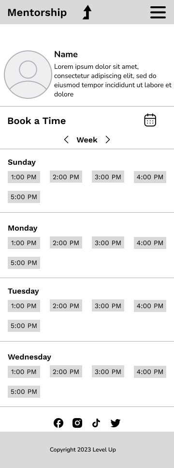
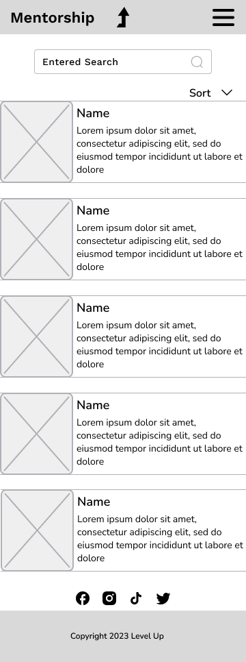
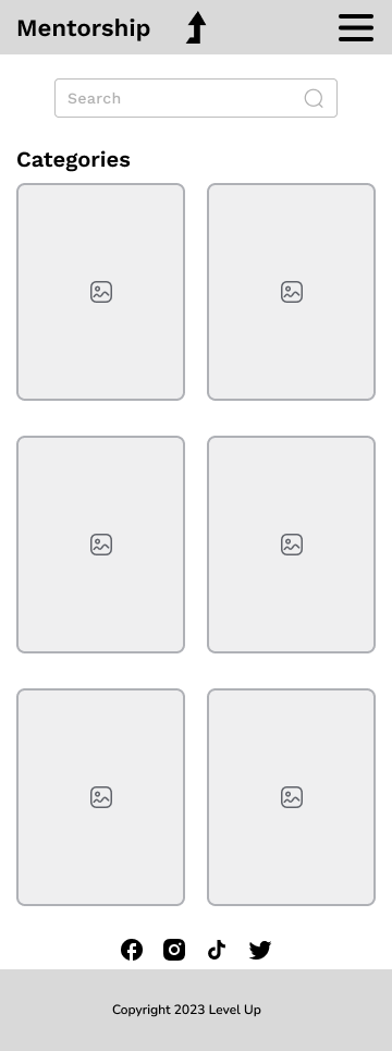
Finally, it was time to bring my wireframes to life and combine all I had developed so far.
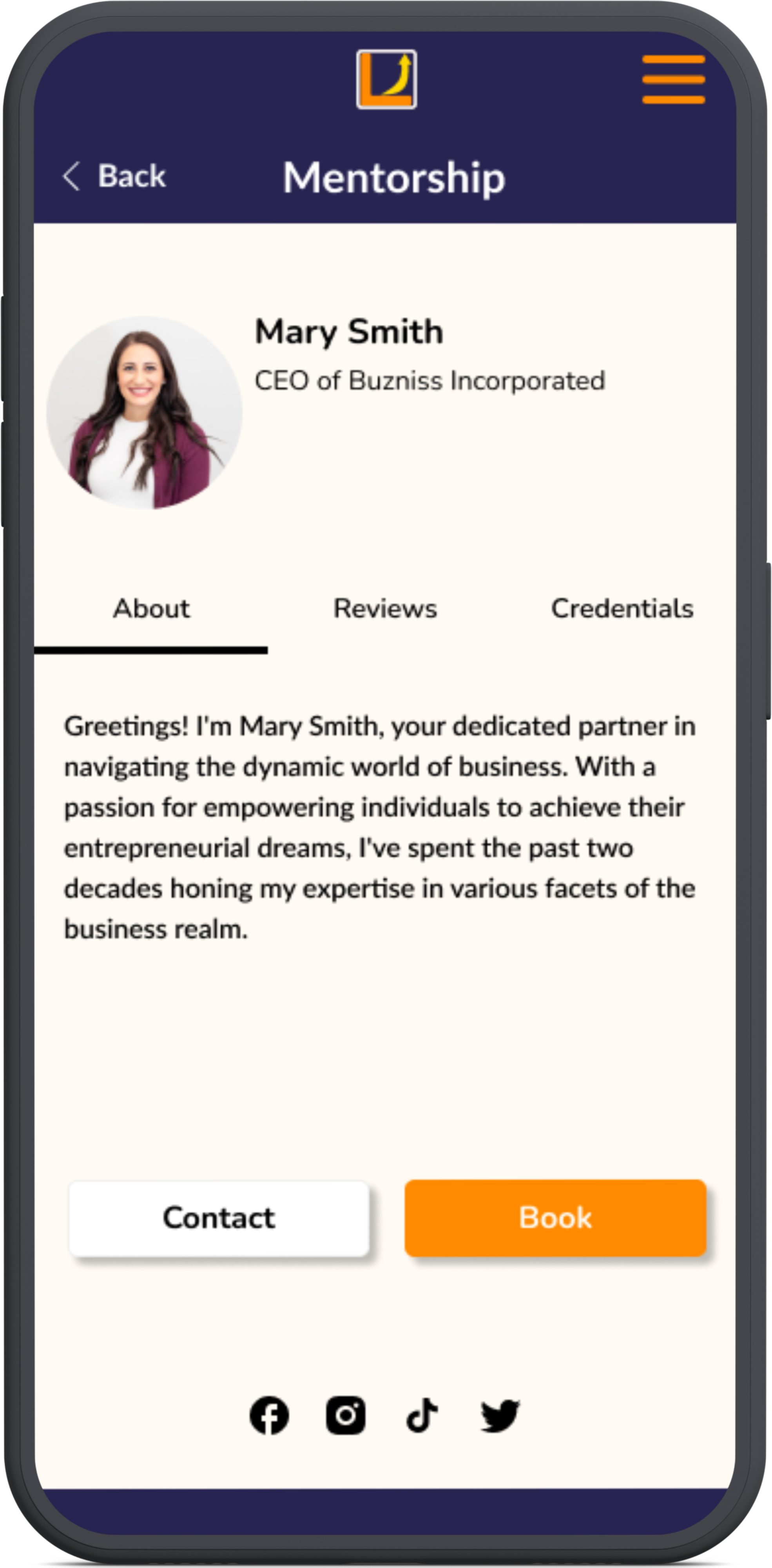
I loved combining all I had done and learned into a tangible result. After a couple of iterations and discussions with my mentor, I came up with this design:

Testing
I then created a prototype that was used in usability testing. Using the application Maze I developed a guided test. I tested the ability of the user to successfully complete the task of booking a mentor. I measured the completion and misclick rate, as well as average duration on task.

Through testing I learned the following about my prototype:
Users had various navigation issues
Certain labels could use more clarity for navigation
Feedback that the user had completed their action would be beneficial.
After taking into account user feedback and usability testing results, I came up with the final redesign.


Next Steps
If this were a full product for a client and I were to continue development, next steps would be to do further usability testing on the redesigned prototype and see if there was an improvement on the success metrics I outlined. Afterwards, I would turn my attention towards developing the rest of the user flows, eventually bringing them into higher fidelity and ultimately usability testing them.
I learned a lot in this project about design and UX. My biggest takeaway is that you can always go back and redo work, nothing is final.
I am proud of the final product that I put together, and I had a lot of fun designing it.
Explore my other Case Studies
End To End App: EventMap

End To End App: TripTogether


Add a feature: Starfield