

Eventmap is an event booking application designed to help users find nearby events of all types based on their interests and hobbies.
This project took approximately 80 hours. I was the sole UX designer.

The Problem:
For this project the problem I faced was “How do I tailor this application towards a user's specific interests?” I decided the best way to do this would be to integrate a user interest selection system and integrate that system into the onboarding flow. This way users will have a tailored experience every time they use the app afterwards.
My goal was to ensure further editing of the interests was straightforward, easy, and enjoyable to use.
I identified the core problem through a series of user interviews. These interviews revealed to me a common trend with people that they felt difficulty finding events relevant to them. They also suggested that they would enjoy some sort of hobby/interest tag system.
Time To Dig In
After discovering the main issues I faced, I did some competitive research to get a feel for what current applications and websites offered. After I had a good idea I set up and conducted several user interviews.
I asked them questions such as:
-“Can you describe an experience you had with an event-booking app that frustrated you, and why?”
-“Tell me about something you enjoy about current applications.”
The interviews I conducted and the questions I asked helped me identify and prioritize the feature of tailoring recommendations to users' specific interests. Interviews were conducted remotely over zoom.
Crafting the Personas
My next step was to synthesize my research into some user personas. What do these users act like, what do they like? Hate? I used these personas to solidify the user in my mind.


Bringing the user flows to life
Next I developed some lofi wireframes to block out how I wanted the interface to look. I focused on developing the user interests tag system, trying to emphasize ease of use. For the browsing and booking flow I wanted the experience to be linear so that it was easy to keep track of where you are during the process.
Top Flow: Choosing Interests
Bottom Flow: Browsing and Booking

For styling I went with a light fun color palette. This fit the aesthetic of an application designed to help users find fun. I chose a bold orange accent color to direct users' attention to CTAs and buttons. I designed the logo and chose the font choices to reinforce the branding.

Prototyping and Iterations
Using my lofi wireframes, I developed a higher fidelity version of each flow using the style guide I developed.
Then I made a prototype with my high fidelity wireframes, imitating the functionality the core features I developed would have. Then using Maze I conducted usability testing with several individuals remotely. I tested both visual design as well as functionality.

Testing Usability
-
6 Users participated. The user was asked to perform three tasks. The tasks are as follows:
1. Signing Up for an Account
2. Editing Interests in User Profile
3. Browsing Recommended Events, and Booking
The following metrics were recorded:
Completion Rate
Misclick Rate
Average Duration on Task -
-In an opinion poll at the end of testing, users said they felt the prototype was easy and straightforward to navigate. Specifically when asked, users rated the ease of navigation a 9.4/10. (10 Being “It was very easy”)-Users wished that the booking button is able to be seen immediately instead of scrolling
- In a user poll, on a scale of 1-10 (10 being the most useful) users rated the “interest adding feature” an 8.6, indicating they felt the feature was a good addition to help them find recommended events.
-Some users desired the login button to be bigger to be easier to find.
-Misclick rates suggest that the users were able to find things quickly but not immediately.
-Users had difficulty finding the account information button. Though this could have been confusing because the user did not choose the profile image themselves in the test so they didn’t know what it was. -
From there I summarized the following iterations to be made:
-Make the log in/sign up button wider and more prominent
-Try making it so the ‘I’m interested button’ on the event information page floats at the bottom and maintains its position so it is always visible.
-Try a different aesthetic to the event info page to increase readability.
-Change the account page button to a generic profile icon rather than the users photo
Summary
Some key things I learned from this project were:
-Certain design decisions such as button size and placement is very important for ease of user interaction.
-Introducing key features in the onboarding process is highly effective at increasing user participation in key features.
-When testing, users may not be familiar with certain buttons as they might if they had time to become familiar with the website. For example, a generic placeholder account button works better than an image of a fake user the user hadn’t chosen themselves.
What would my next steps be?
I would go back and change some of the aesthetics and button sizes to increase readability and lower ‘time to target’ for confirmation buttons. From there, I would conduct further usability testing to see if my tracked metrics improved between the first and second round of tests.
Thank you for reading!
I appreciate you taking the time to look through my case study. If you have any questions feel free to reach out, I would love to discuss this project more!
Explore my other Case Studies
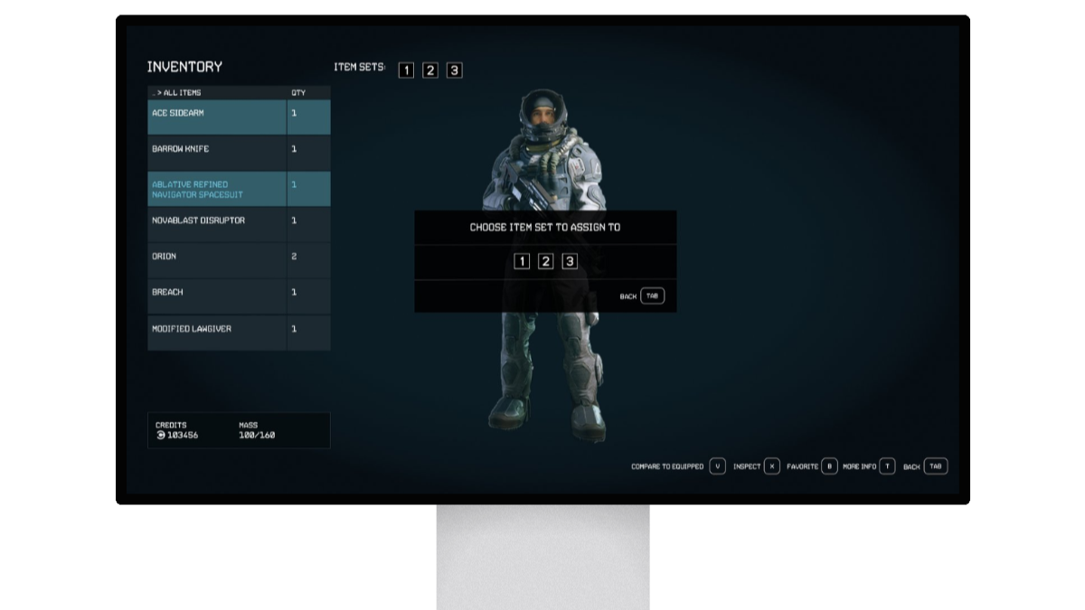
Add a feature: Starfield
End To End App: TripTogether

Videogame UI: Hawthorn
Digital Clone: Warehouse Management Software
