

Adding UI Features to Starfield
Prototype: Desktop Only
Starfield is a Sci-Fi open world role playing video game where you explore space, do quests, and meet interesting characters. Its user interface elements involve managing your character as well as your abilities and inventory. I chose to work on this project because I enjoy videogames and working on game UX/UI is a dream of mine.


For this project I chose to focus on improving the functionalities of inventory management in Starfield. My primary goal was to incorporate new features that users wanted, while preserving the games existing minimalist style. I aimed to cater to users that were seeking improved navigation and additional functionality in the game.

Research
My research involved discovering current user preferences and pain points through a combination of a user survey and user interviews. Through these methods I identified key aspects users appreciated and desired improvements on.
I interviewed several people of varying levels of familiarity with video-games, from never having played a game to having played Starfield.
The interviews revealed a few key things that users desired:
Simpler item transfers - Users were getting confused what they had already transferred.
Easier to utilize expanded info for items - Users wanted to be able to see more information at once in the interface.
An expanded form of “favoriting” items - Players had difficulty quickly finding certain items they wanted in their inventories.
After conducting research I crafted a representative persona to understand the target audience better.

Design
User feedback shaped my design direction. Insights from interviews highlighted key desires and illustrated that users favored adding to existing features rather than removing them.
Lo-fi sketches and hi-fi wireframes were developed in Figma. These gave me a starting point to begin to test my design solutions. To best capture the feeling of navigating the game interface I spent time recreating the user interface from scratch. I felt it was important to immerse the users in an identical environment to the game to get the best feedback.
The features I added were the following:
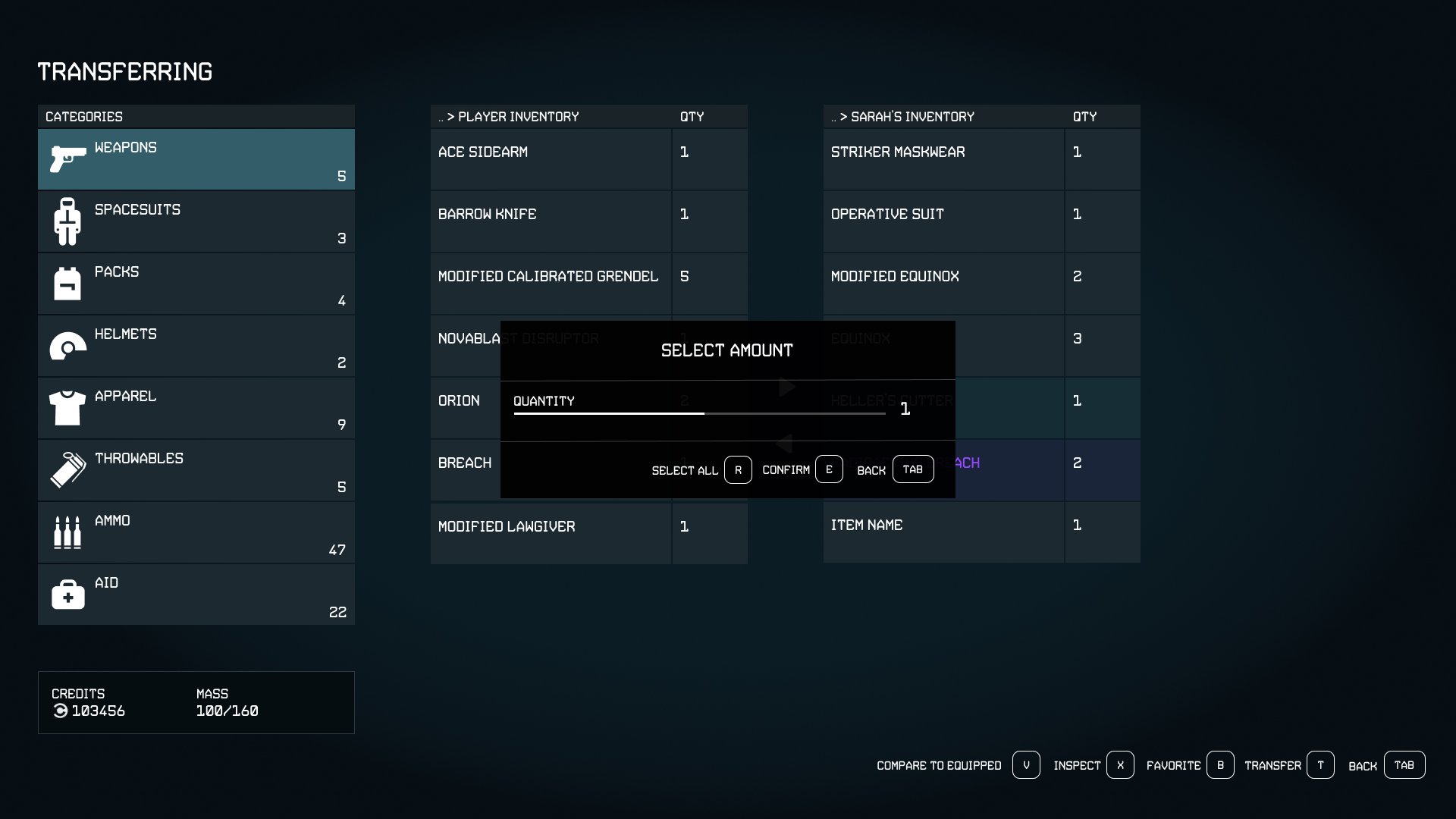
A side by side comparison of inventories when transferring items
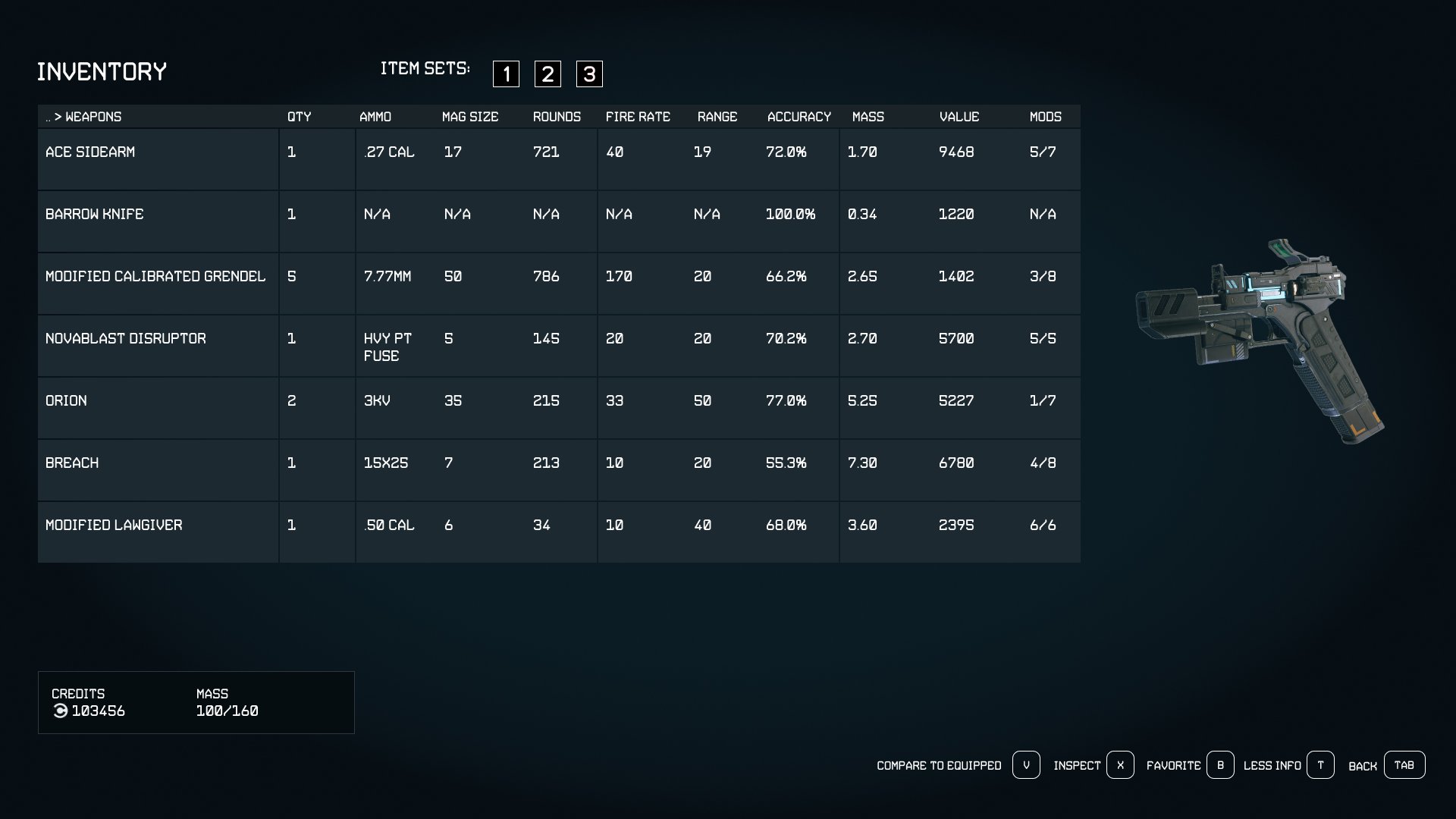
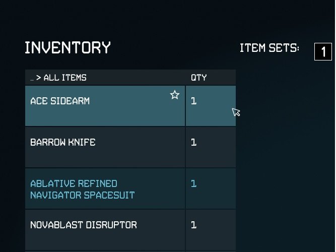
A expanded view of information simultaneously for all items in the inventory.
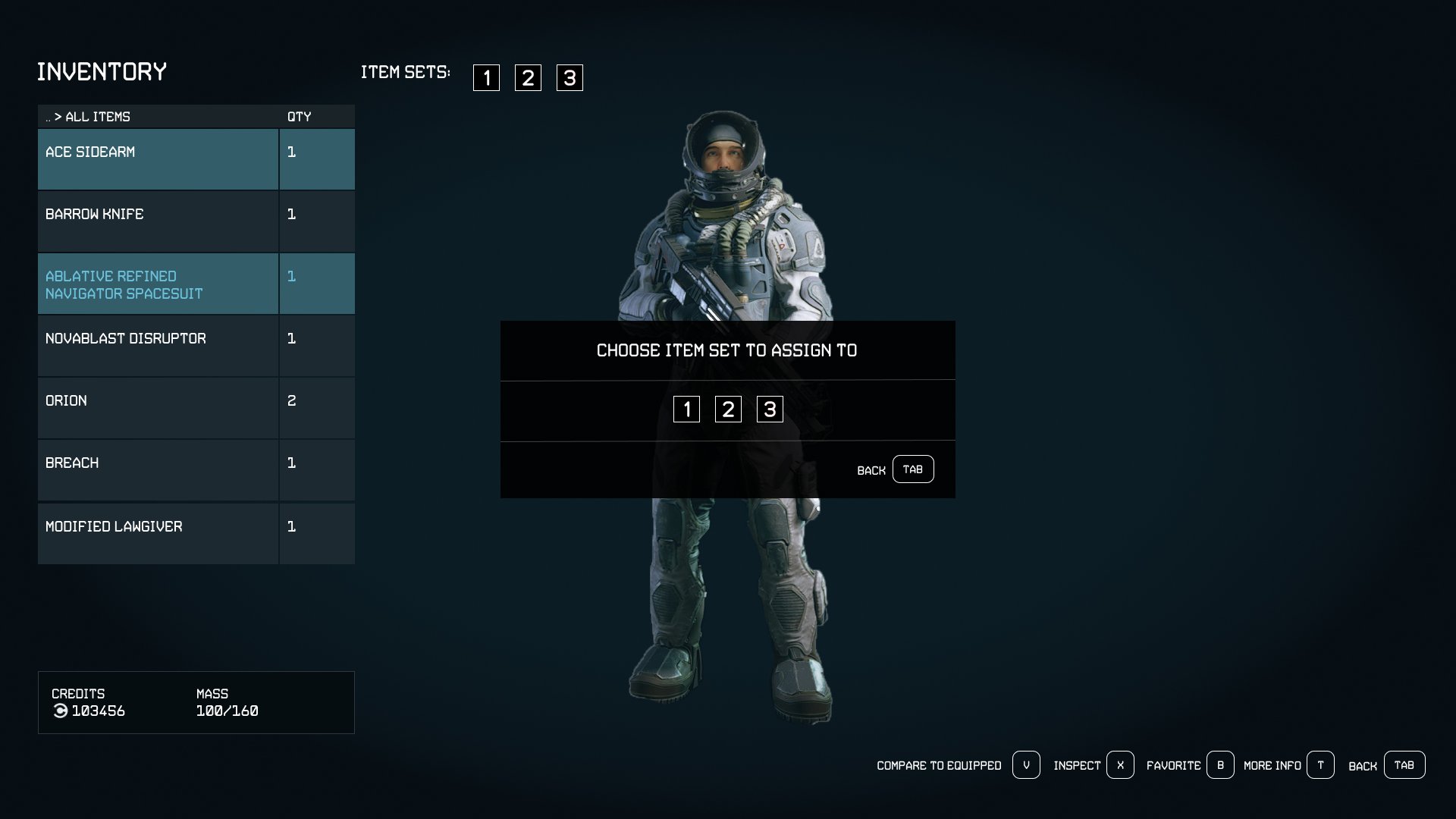
A system to favorite items and assign them into item sets.
The following features left to right, top to bottom:
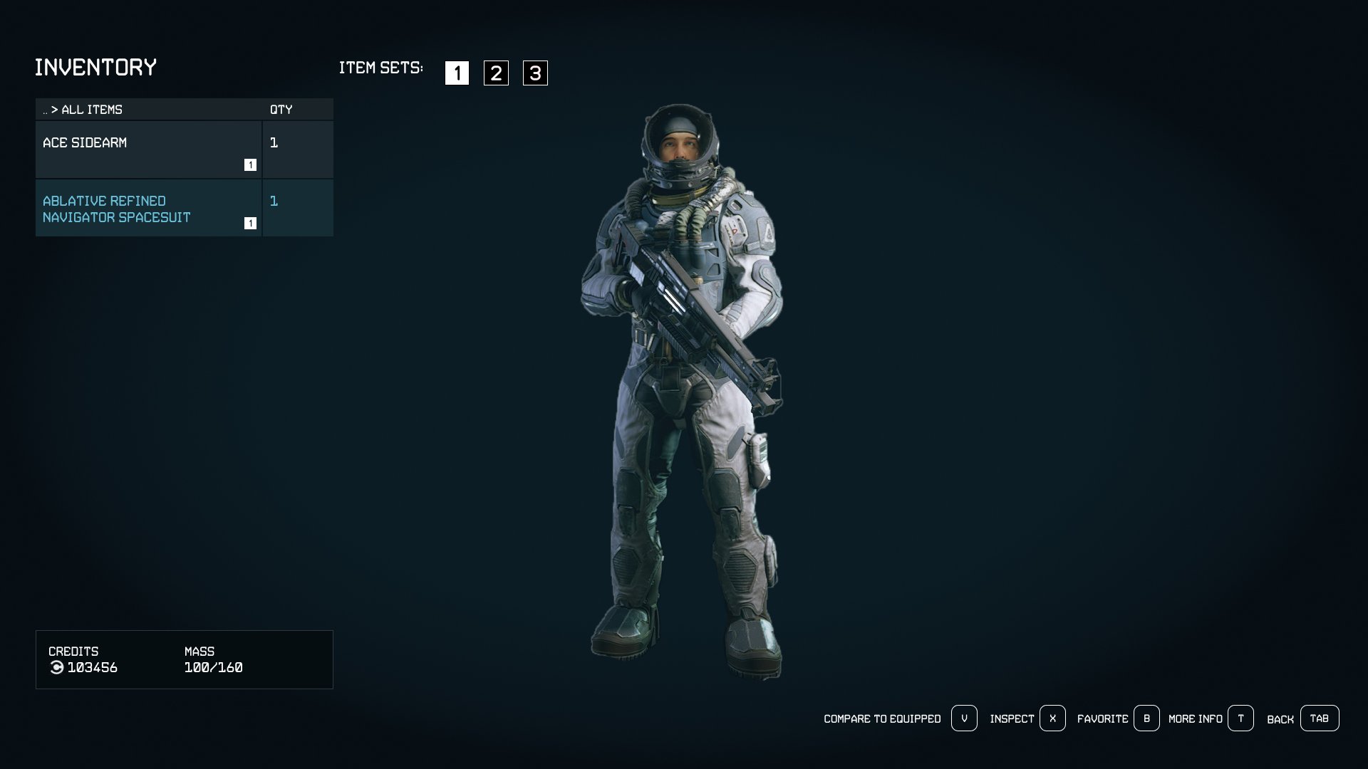
Showing users a selected item set
Choosing which item set to assign favorites to
Showing expanded inventory information
Confirming item transfer and side by side inventories
Testing
Usability testing was then conducted on the prototypes that I made. Using the tool Maze I tested visual design, success rates, time on task, misclick rates, as well as whether the users felt the features implemented were useful. 11 People tested the prototype.
Testing Results
The user was presented with a set of three tasks to complete. These tasks are:
1. Transferring items to your inventory
2. Choosing to show ‘More Info’ for items
3. Favoriting item sets
Feature 1: Adding side by side inventories for transferring

Shown here is a single screens heatmap of where users clicked. Users were trying to find the ‘Confirm’ button for the popup. On this screen specifically users spent 2.7s completing the task and had an average of 27% misclick rate.
Feature 2: Showing more information on items in inventory at once

Shown here is a single screens heatmap of where users clicked. Users were trying to find the button to show more information. On this screen specifically users spent 14.9s and roughly half of users misclicked.
Feature 3: Adding favorited items to item sets.

Shown here is a single screens heatmap of where users clicked. Users were trying to find which button to press to favorite their item. On this screen specifically users spent 8.2s completing the task and 40% of users misclicked.
Takeaways and Iterations
Key takeaways include:
-Favorites button has an unclear function
-Users were surveyed after completing each task and asked how useful they thought features were. They rated the features an average of 8/10.
-Some users struggled to find the appropriate button to execute an action.
User quotes:
“Everything was very intuitive and easy to understand, especially for someone that doesn't play this game!”
“It was hard to find where the 'favorites' button was located for the last question. Overall, the other tasks were easy and straightforward.”
“It would be helpful to have some clearer indication of the favorites in the UI, it was a little unclear that the highlighted sate was a favorite, and I'm curious how favorites across sub menus other than All Items would work”
“I don't play Starfield but given the context of the first two features (swapping weapons and seeing the info of a weapon all at once), I feel like these would be really convenient features to add for this game!”
Based on my feedback I received, I came up with some iterations to make on the prototype I came up with.
-Change the “Favorite” button to be worded differently. Something like “Add to Item Set” may communicate the effect more clearly.
-Increasing visibility of buttons to add items to favorites. Possibly add a star or heart button on each item to allow quick adding of single items.
-Experiment with size and spacing of the hotkey row at the bottom to make it easier to see.
-Try out adding more ways to accomplish actions with more buttons in different places, such as a show more info button.
I then executed on my ideas and developed the following iterations:


Before:

After:
Added more spacing and size to button row. Changed wording to ‘Add to Item Set’


Added ‘Show more info’ toggle
Added a star icon that can be selected to favorite an item and prompt selecting item set
Reflection
A challenge I faced was figuring out which features I had the time to implement, and how in depth to make them. I had to make many concessions to things I wanted to do but couldn’t fit in. I learned to prioritize features based on time. Talking to users helped me understand what to focus on.
In future work, I will expect not to be able to do everything to the extent I might want. With more time I would have gone more in depth with features, and tested multiple versions of the same feature to find what works best. Ideally A/B testing could be done.
The next steps would be to do another round of usability testing, to see if my iterations improved the product or not. Following that I would return to my interview and survey analysis to find what features users would find next most important. I would then see about developing other features users commented on wanting. If I ran out of insight, I may do another round of interviews or surveys.
I am most proud of being able to successfully implement the features that the users wanted. Getting people to genuinely appreciate the new functionality was great.
Tools used: Figma, Adobe Photoshop, Maze, SurveyMonkey
Note: This is a student project, it is not affiliated with Starfield or Bethesda Games
Explore my other Case Studies
Event Planning App: EventMap

End To End App: TripTogether

Videogame UI: Hawthorn
Digital Clone: Warehouse Management Software

