
TripTogether is a mobile website that enables the user to find other users to embark on road trips with.
Project Time: 80 Hours
Tools Used: Figma, Photoshop, Maze, Canva, Whimsical
Roles: Sole UX/UI Designer
TripTogether

Prototype: (Desktop Only)
The Problem
The main problem I was solving was how to make a road trip website that made users feel safe and secure while using the product.
I was solving the problem for all the people who want to save money on long journeys but are apprehensive about sharing a vehicle with strangers.
I first needed to identify what rideshare apps made users feel unsafe.
My solutions needed to improve people’s sense of freedom to then be able to travel long distances without being limited by having a vehicle or more expensive travel accommodations.
Research
I conducted user interviews over Zoom with several people to identify pain points and desired features.
I asked the users questions such as: “Which features would you like to see in a rideshare website?”, “What would make you feel safer using a rideshare app?” and “What things do you dislike about current product offerings?”
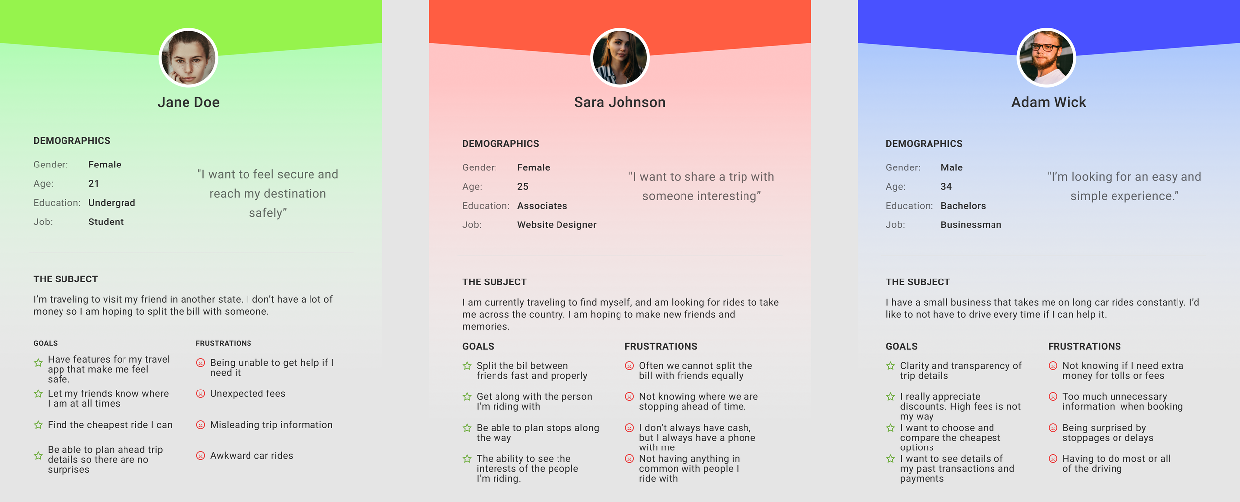
Through my research, I learned that the most important thing to users was feeling safe and that the service was reliable.
Most users interviewed mentioned the desire for transparency and safety features.
Interview Quotes
““I like to know my drivers ratings. I wish there was more transparency with the rating system, aka being able to see how many people gave what rating and what they had to say about the driver.””


“A send my location feature to send your gps location to a friend. So that way they know where I am in case I get into trouble or need help. That security is helpful I feel.”
Defining the Solution
I began doing some secondary research, seeing what other offerings their were already on the market. I then did User Interviews to define what users thought about similar products.
Afterwards I synthesized research into personas and created user flows based on features I found the most desired/useful.
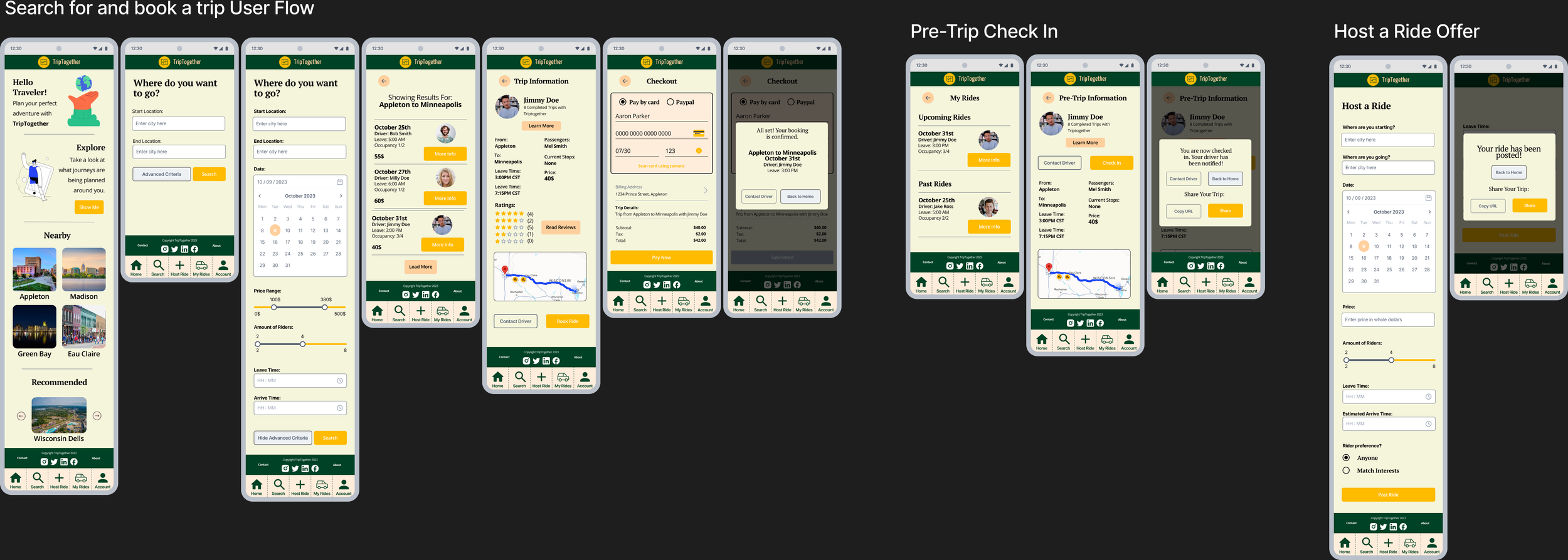
Lastly, I created lofi sketches then a hifi prototype based on the final iterations of my sketches. Usability testing was then done.
Creating the Designs
I created a basic layout for my user flows, modifying them as I worked and thought of improvements.
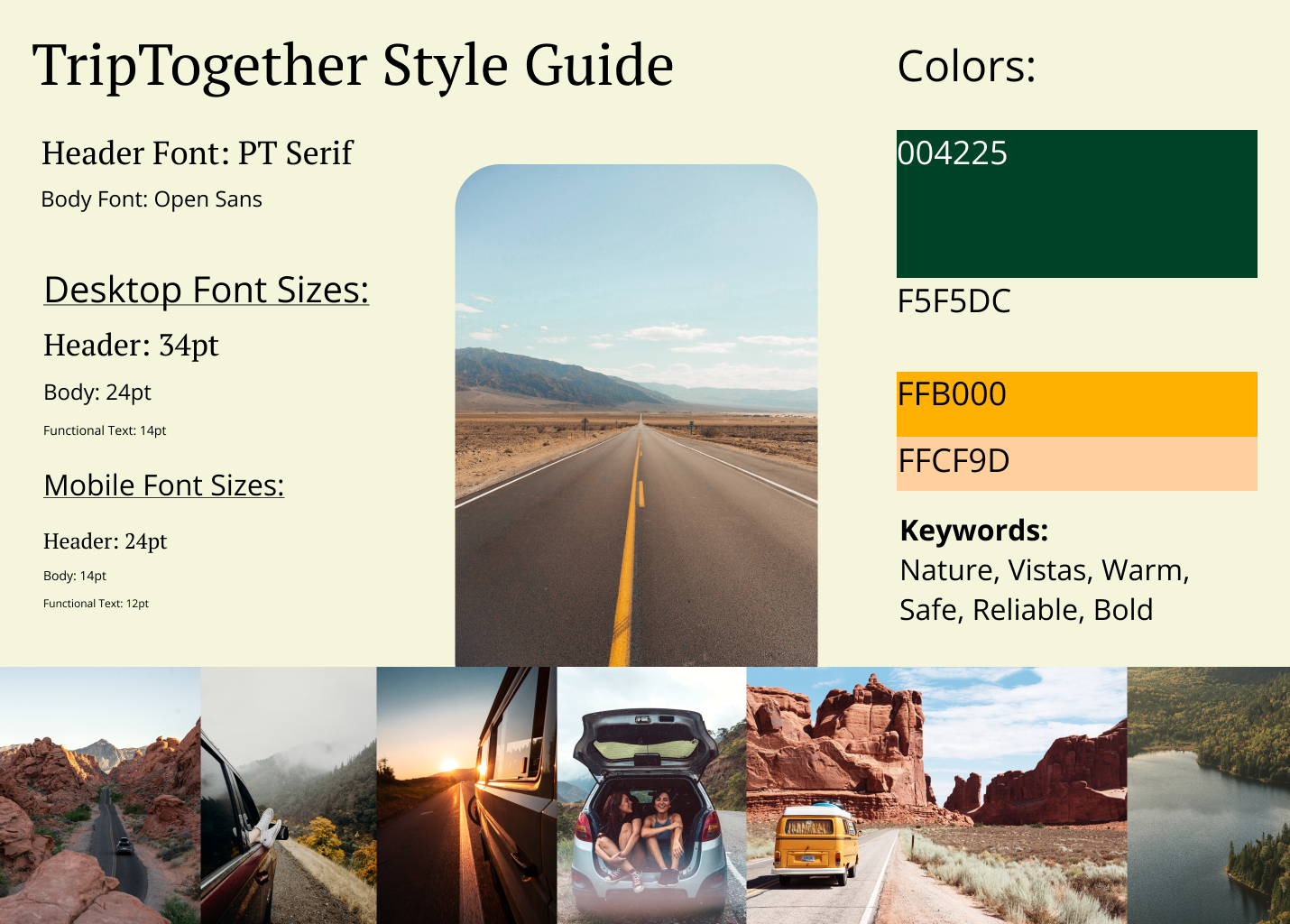
Branding was chosen to reflect a feeling of reliability, safety, and adventure. Warm earth tone colors and strong yet readable fonts.
My favorite part of the process was developing the high fidelity prototype and testing it. Seeing the feedback to my decisions was engaging and inspired me to make improvements to enhance their experience.


Developing the Style
Testing my Prototype
Using the tool Maze, I developed a usability test for the three user flows I made prototypes for. I tested visual design as well as whether the features included would make users feel safer using the website.
Insight from testing:
Button labeling for advanced criteria was unclear
Instructions for first task were unclear
Confirmation popups held too many buttons, confusing users
Some buttons for the ride listings could be added to streamline process
Features included to increase feelings of safety and comfort were successful:
On a scale of 1-10, users rated the feature to share your location as an average score of ‘9’ in terms of how safe it made them feel.
On a scale of 1-10, users rated the information provided on the hosts profile an average score of ‘7.8’ in terms of increasing their feelings of reliability and safety when booking.
Users rated an average of 9/10 for the question “How confident did you feel during the missions that you were proceeding correctly?”
Conclusions and Takeaways
A challenge I faced was figuring out where to include the features users said they wanted. I had to rethink my initial site layout I had in mind.
I learned to keep an open mind to users' desires and needs. Going into the project I did not have safety on my mind at all, instead focusing purely on the visual design aspect of it. Talking to users showed me a brand new perspective.
In future work, I will go into projects more open minded about what the product might encapsulate. I won’t develop too much framework mentally until I have done user research.
With more time I would have included more user flows and interactions within the prototype. Some users expressed a desire to be able to ‘explore’ the app more, which I take as a good sign that the website was enticing and welcoming to use.
The next steps would be to do another round of usability testing, to see if my iterations improved the product or not. Following that I would work out fleshing out the user flows I have and adding more.
I am most proud of identifying the users primary desires and needs and being able to deliver on that successfully in the prototype. Getting to see the research be affirmed during testing was very motivating and cool to see.
Explore my other Case Studies
Add a feature: Starfield

Event Planning App: EventMap

Videogame UI: Hawthorn
Digital Clone: Warehouse Management Software
